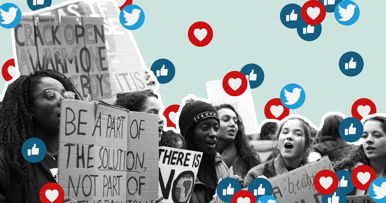
Designing for the Next Generation
Design can be a powerful communication tool for your brand and marketing strategy when used correctly and effectively.
According to Altitude, Generation Z (Gen Z) has now accounted for 40 percent of all consumers. So, what does that look like? What are their values? What can you do to stand out in their digital space? In this post we’re sharing a few tips to help you navigate designing for the next generation.
But first, who is Generation Z?
Gen Z is anyone who is born after 1996, according to Pew Research Center. They are primarily children/child of Generation X and is known to be the most educated and diverse generation. They were born in the digital age and are influenced by events such as—social network, smart phones, great recession, election of Barack Obama, gender equality, etc.—making them acceptable to changes and pushing culture and gender barriers.
How to design for Gen Z
COMMUNICATE WITH AUTHENTICITY
Having grown up in the digital space, Gen Z has the knack for filtering through many unwanted noises. If your brand comes off as needy, intrusive, or inauthentic they will dismiss and unfollow your brand entirely. Instead, be your authentic self and share things that align to your brand values. Doing this will help you capture the right kind audience and earn their loyalty.
HAVE A COHESIVE AND FLEXIBLE BRAND
Gen Z is more likely to follow brands that reflect their own values, causes, and lifestyle. But this generation is also open-minded and dynamic, which makes their ‘characteristics’ hard to define.
To keep the attention to the ever-changing Gen Z consumers, you will need a frequent brand refresh to stay with the current time without loosing your brand identity. This means having a fixed primary brand color palette, logo, and typography, with flexibility to introduce new elements, that reflect current ‘trends’. This is a great way to maintain consistency and control while also being flexible.
MAKE SURE YOUR DESIGN IS SHAREABLE AND SNACKABLE
Grabbing the attention of Gen Z’ers won’t be easy. They are great at multitasking and can easily filter information through multiple screens. A good approach to this is to design in their language. This includes short videos, image sequences, images with text overlay, and quotes. Keep it short, digestible, and most importantly instantly shareable.

